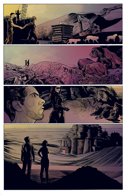
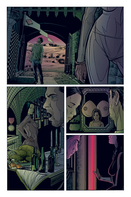
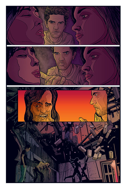
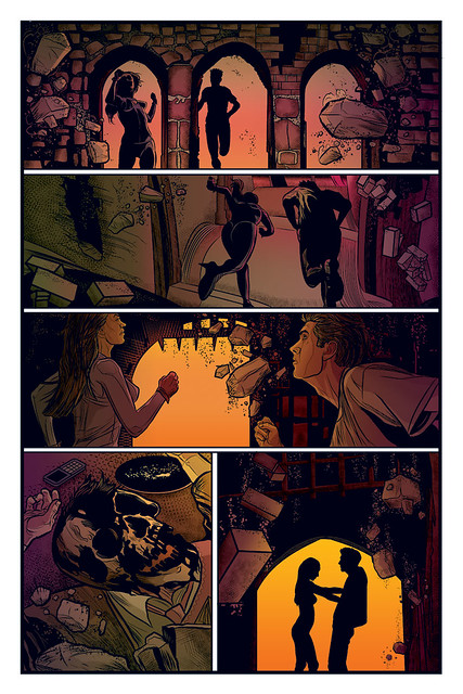
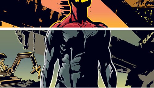
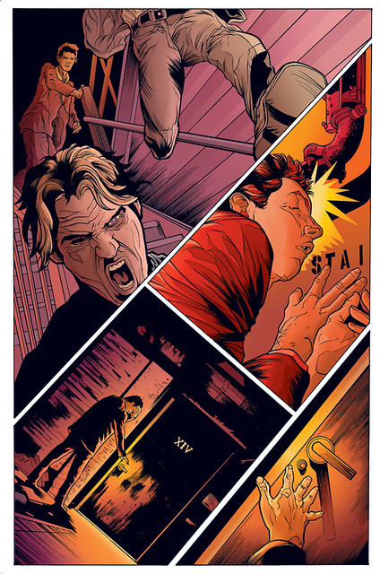
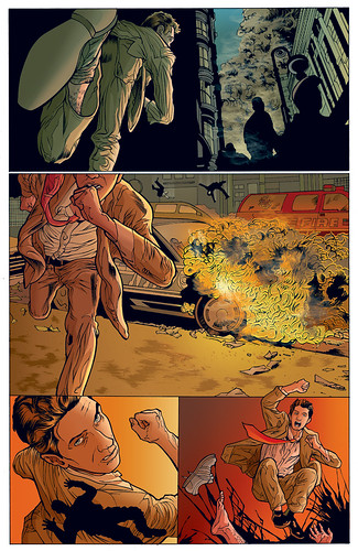
SHADRACH STONE, by me and Jon Proctor, goes on sale TOMORROW, THURSDAY 9 SEPTEMBER!
Here's your last sneak preview. These pages have not been released before.


Your brain has 20 billion bits of information. The repeating loops between various bits make up your private reality-labyrinth, the thoughts, feelings and (apparent) sense impressions that you keep encountering over and over, year after year.
You encounter them over and over precisely because they are repeating tape loops.
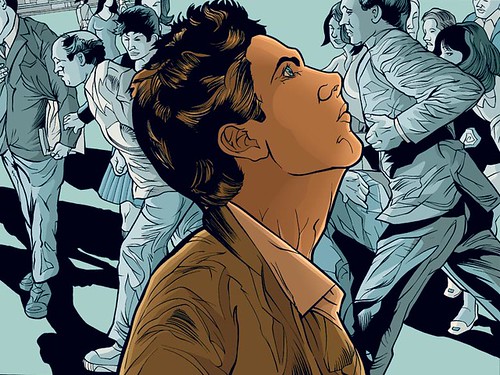
Ethnomethodology demonstrates that the loops can be broken at any point, a process technically known as breaching. The result is a rapid reorganization as the 20 billion bits quantum-jump to a different order of coherence. A new “you” and a new “external world” appear in the process. [Emphasis Wilson’s.]
There are [ten to the 2,783,000th power] possible permutations; alternative models of “you” and the “external world.”
Every nervous system creates its own “reality.” Out of the billions, or billions of billions, of energies intersecting the room in which you read this, your brain, performing 100,000,000 processes per minute (almost all of them unconscious to those circuits called the ego and recognized as “me”) arranges a few hundred or thousand into the Gestalt which you experience as the “reality” of the room…I call this neurological relativism, or the relativity of perceived “reality.”